Pia’s Place
A café, vintage shop, gallery and workshop space in King’s Lynn, given one warm seventies-flavoured identity: Pia’s Place, Café & Curiosities.
We love working with new local businesses, especially when there’s already a personal connection behind the project.
Pia came to us while she was planning a new space in King’s Lynn, and from the beginning it was clear that calling it a café didn’t really tell the whole story.
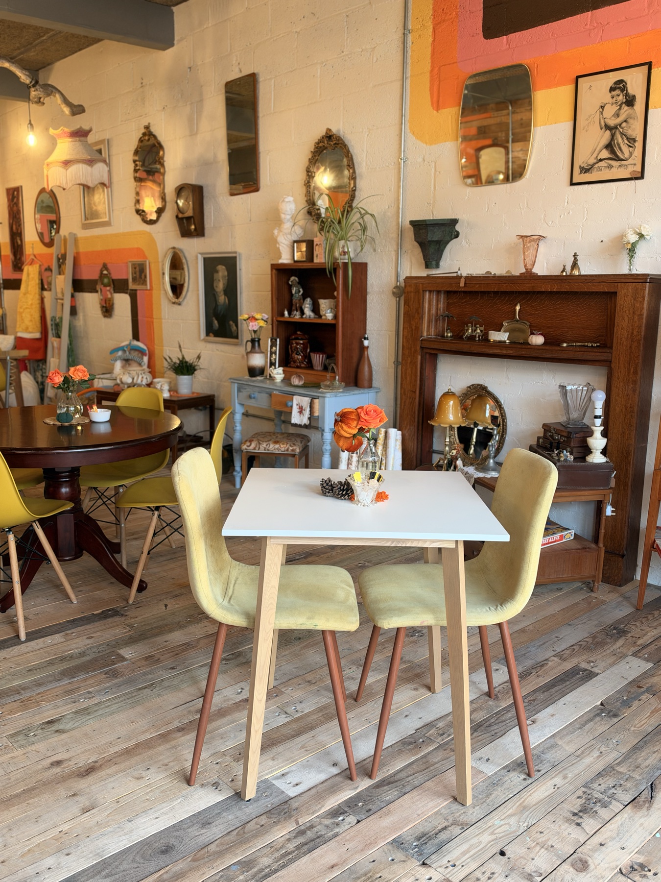
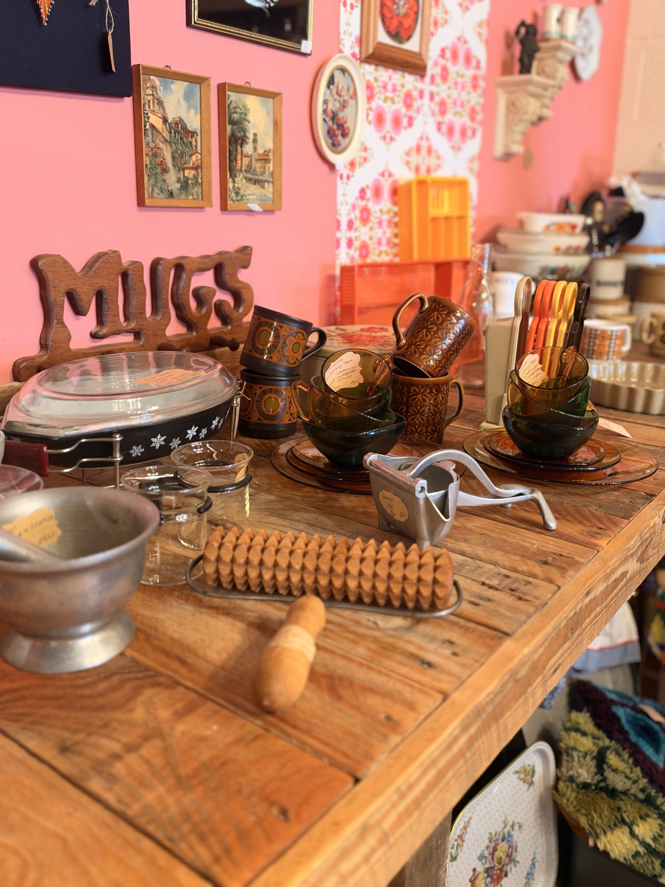
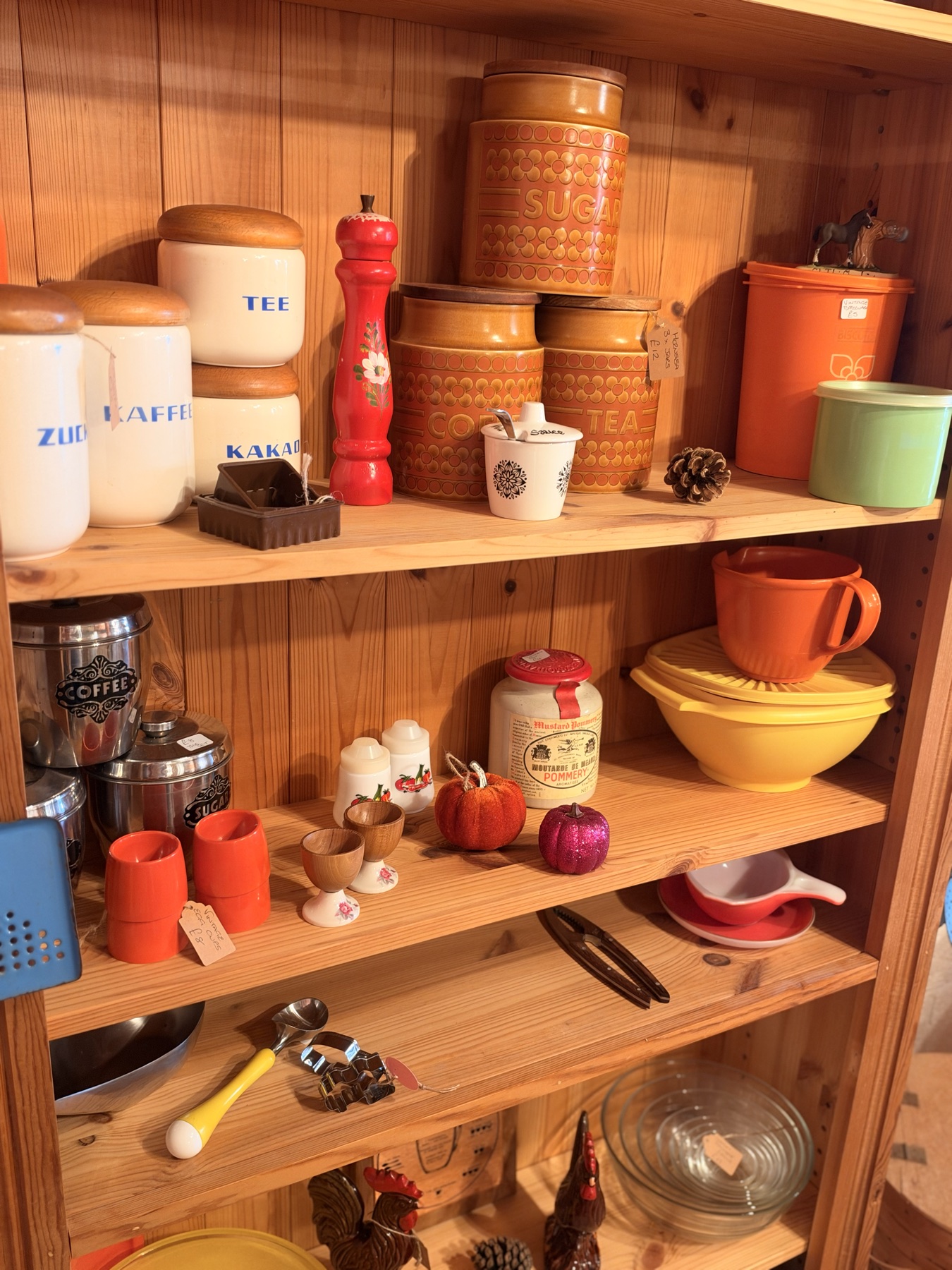
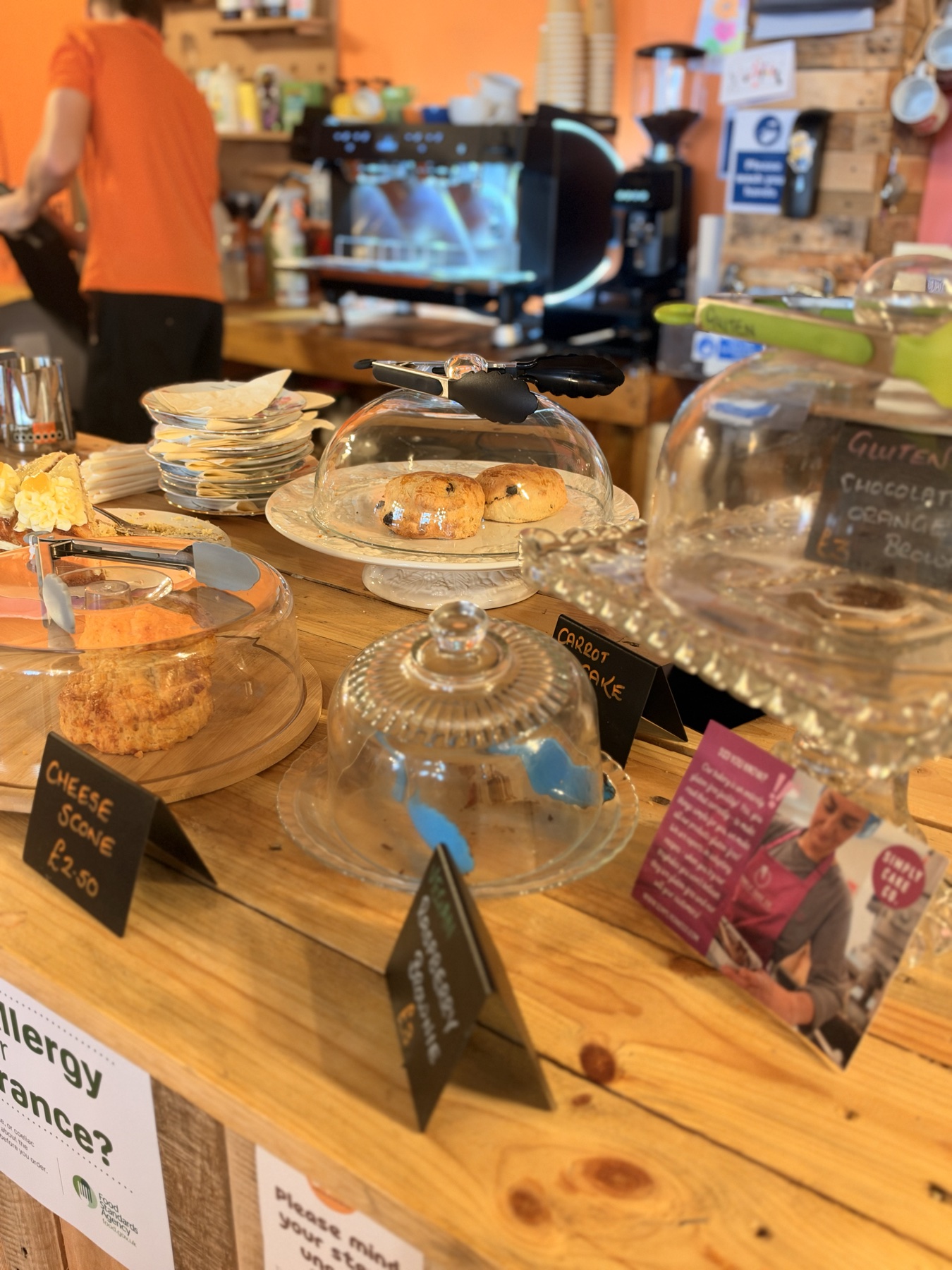
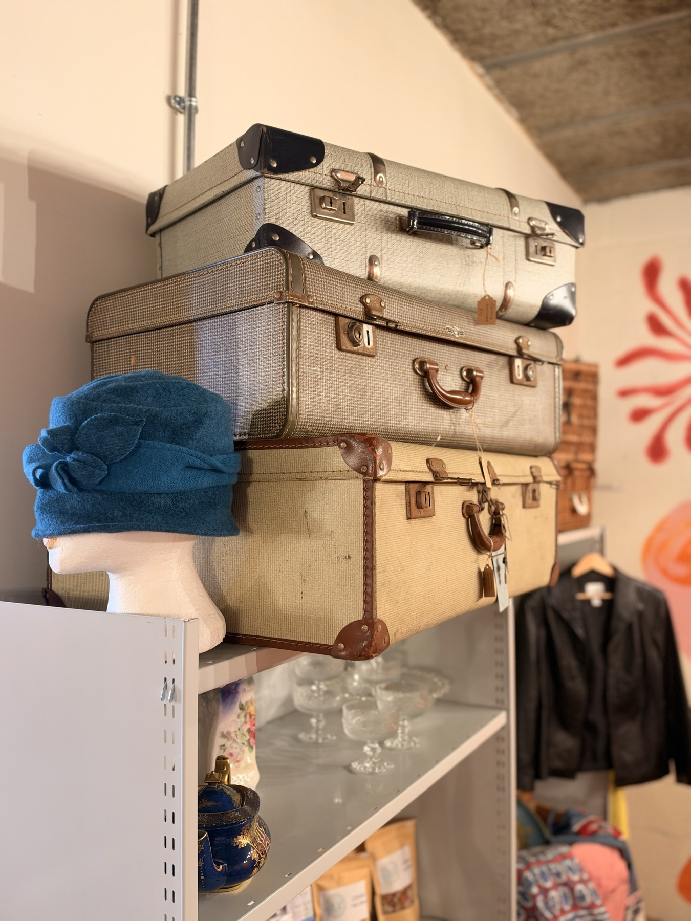
There would be coffee and cake, of course, but also vintage furniture and homeware, a changing gallery wall, workshops, creative get-togethers and all sorts of interesting things Pia had collected along the way. The brand needed to make sense of all of that without turning the shopfront into a list of everything happening inside.
We started with the name, eventually landing on Pia’s Place. It felt personal and flexible enough to grow with the business, while Café & Curiosities gave people a little more context without trying to explain absolutely everything.
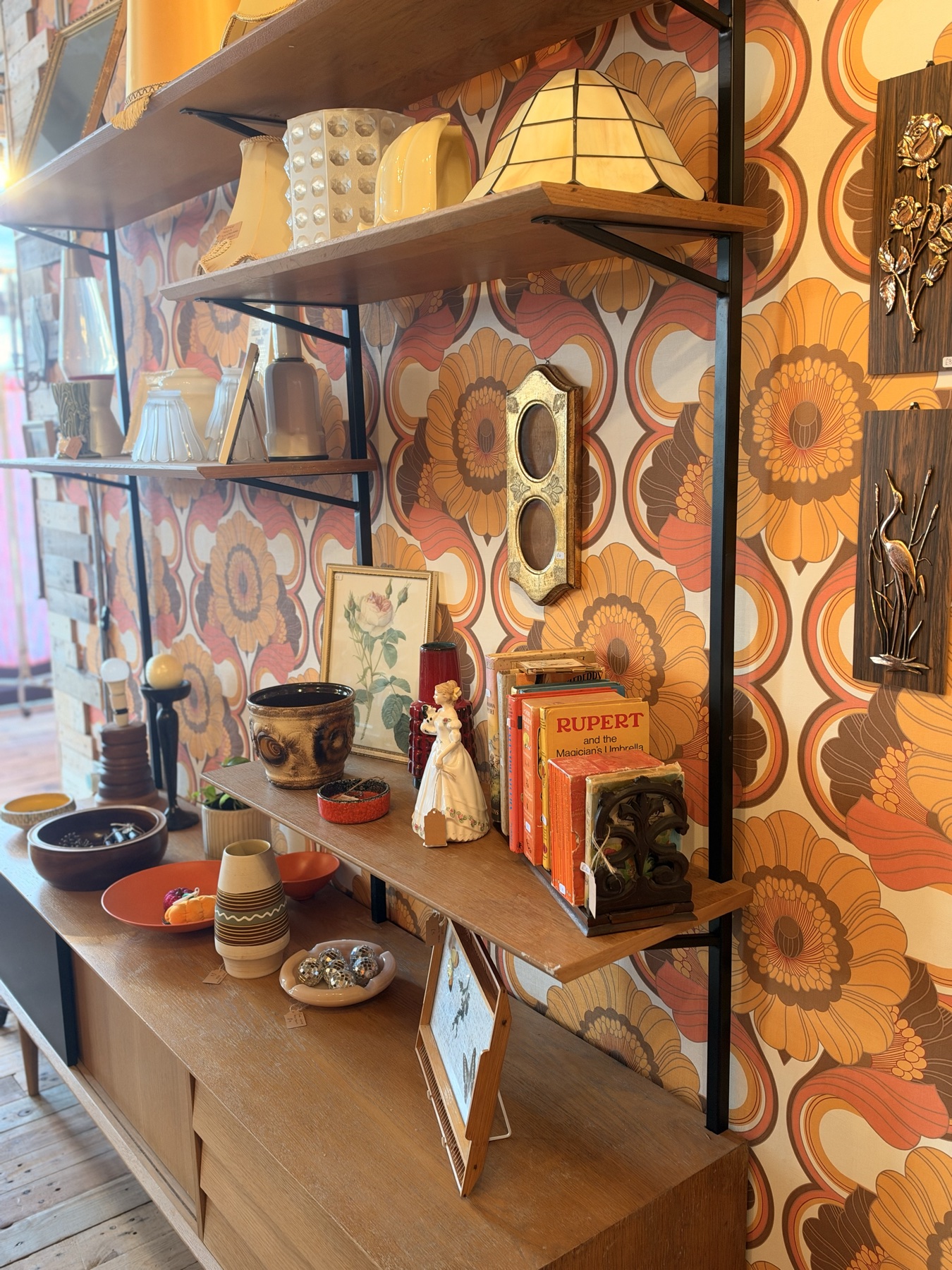
From there, we built the identity around Pia’s love of 60s and 70s design and the character of the pieces she was already collecting for the shop.
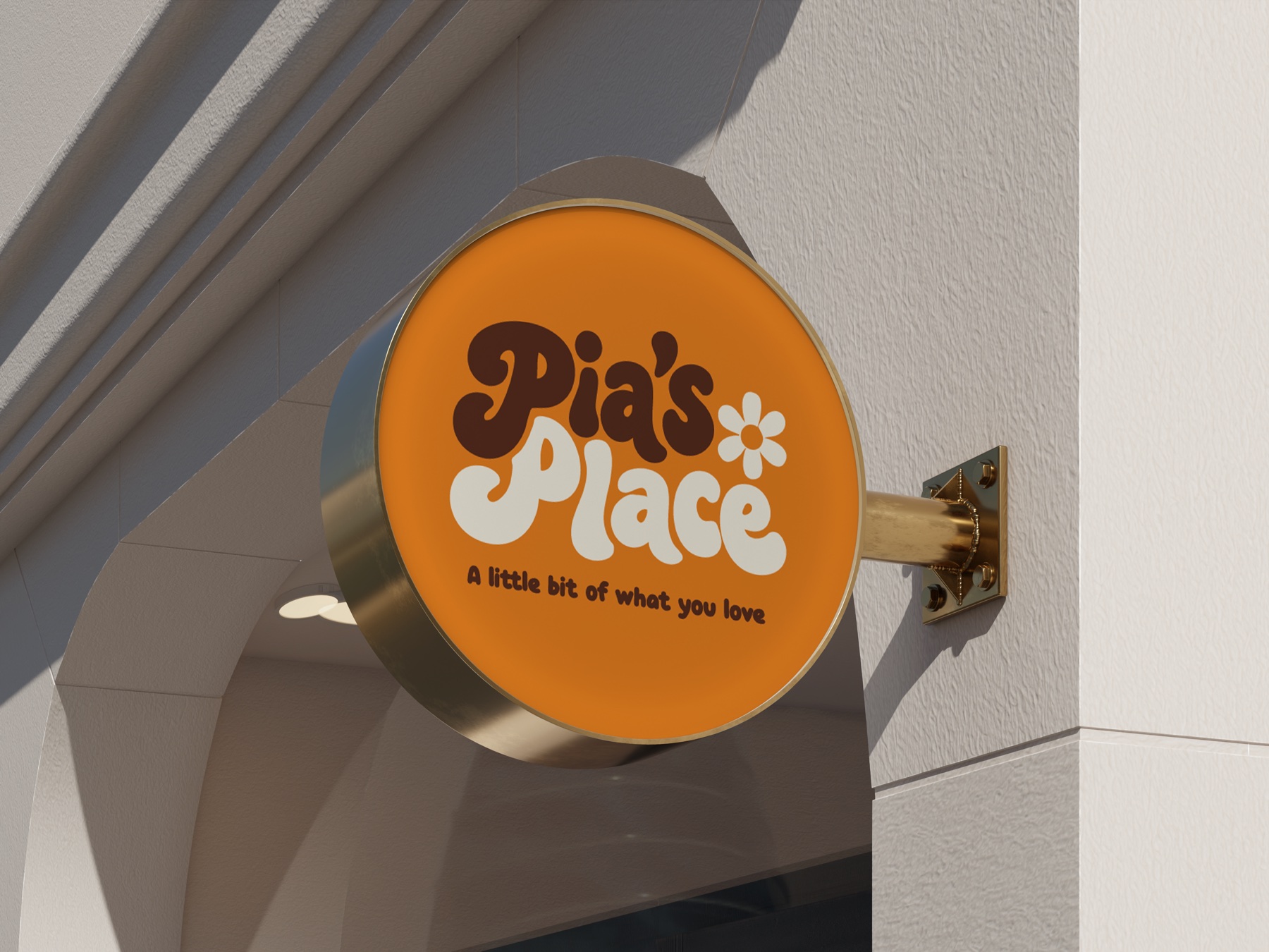
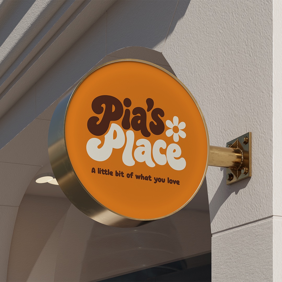
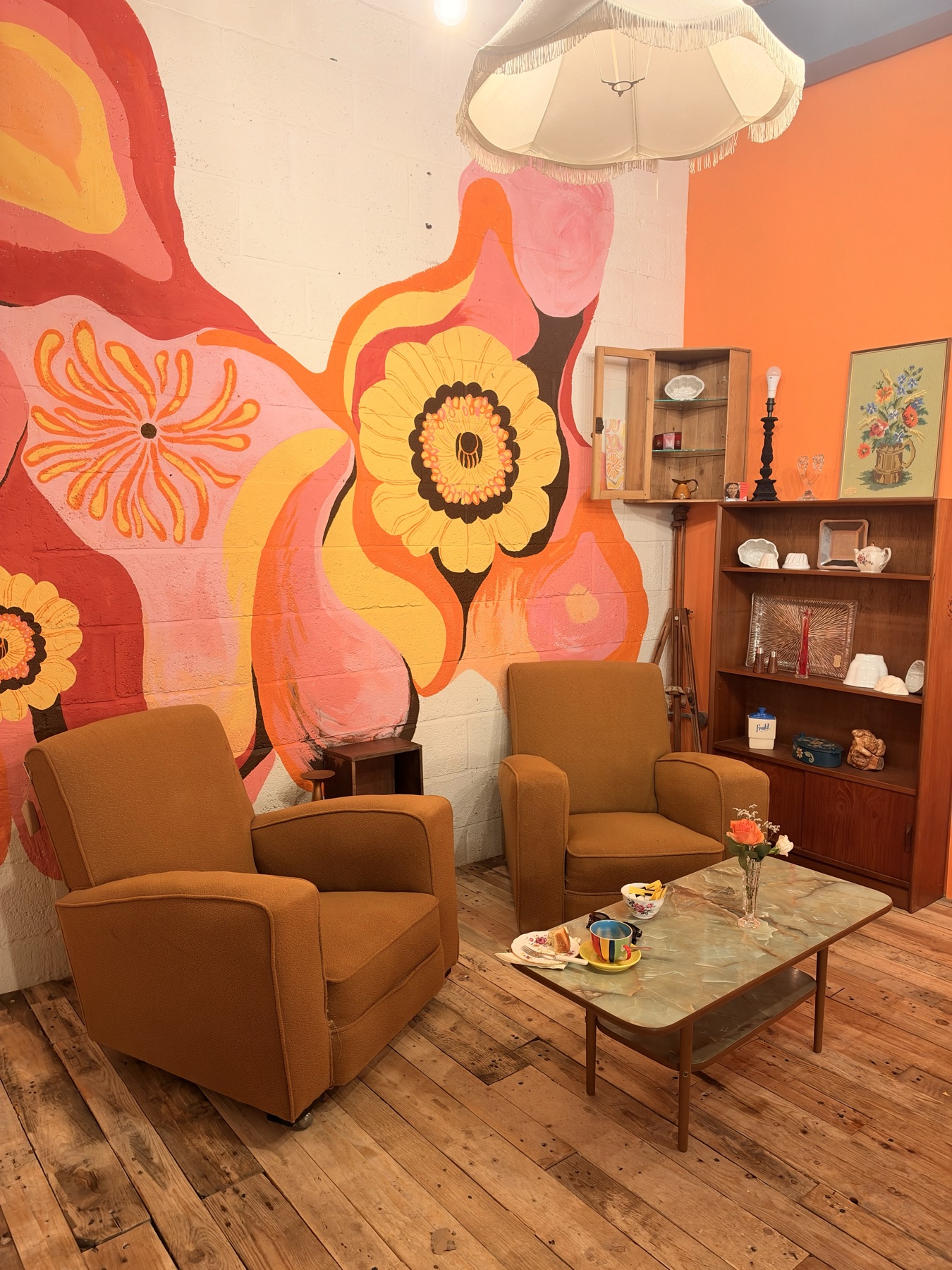
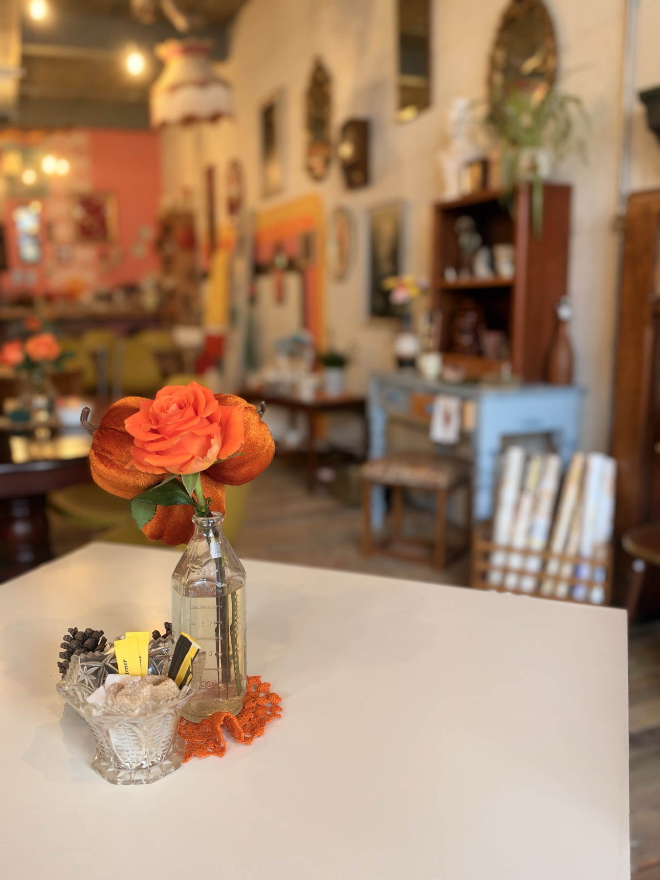
The finished brand uses warm cream, deep brown and burnt orange, with rounded typography, custom-drawn lettering and a simple daisy mark running through the identity. There’s plenty of retro influence in it, but we wanted it to feel like a real place rather than a themed version of the seventies. The colours came from the sort of things that might actually live in the room: old ceramics, warm wood, packaging, furniture and coffee.
The wider identity was designed to be useful too. We created a full family of logo lockups, typography and colour rules, campaign language and guidance for everything from cups and shop signage to furniture tags, workshop posters, social content and packaging. The final brand toolkit gives Pia something she can actually use as the business starts to grow.
Behind the curtain
The thing we kept coming back to was that Pia’s Place is four things in one room.
A café. A vintage shop. A gallery wall. A workshop table.
Trying to give each one its own separate visual identity would have made the whole place feel fragmented, so instead we looked for the personality that connected them. They all have that same sense of finding something you like, staying a little longer than planned and perhaps leaving with something you hadn’t expected to buy.
That thinking eventually gave us the tagline “A little bit of what you love”, alongside lines such as “Good coffee. Old things. New ideas.” They give the brand room to talk about different parts of the business without having to explain the entire concept every time.
There are some intentionally small details in the system too. The daisy can live on a coffee cup, coaster or furniture tag without needing the full logo beside it. The orange is kept as an accent rather than covering everything. Cream does most of the heavy lifting, which keeps the identity warm without becoming visually noisy.
The aim was to create something that already feels like it belongs in the space Pia is building: warm, slightly nostalgic, full of interesting things and not trying too hard to explain itself.
Somewhere you could come in for coffee and quite easily leave with a chair.